I have been using Blender since version 2.40 and have just gotten used to it. It was always way different from other graphic user interfaces (GUI), but features outweighed the awkwardness of navigating around. That has all changed with the almost released version 2.5X. I applaud the massive effort that went into the recoding of the interface. Although there will be a learning curve to get used to it, gladly the control sets and panels remain similar enough to 2.49. Some things are just going to be different, but that is part of the improvement process – change is inevitable. One quick example is the view window control. Before (in 2.49), you could see what view was chosen in the pop-up menu – perspective or orthographic. Now you just have the same functionality as the keypad toggle. However, what you chose is displayed on the screen in the upper lefthand corner with white letters. Yes, different, but pretty cool in the long run.
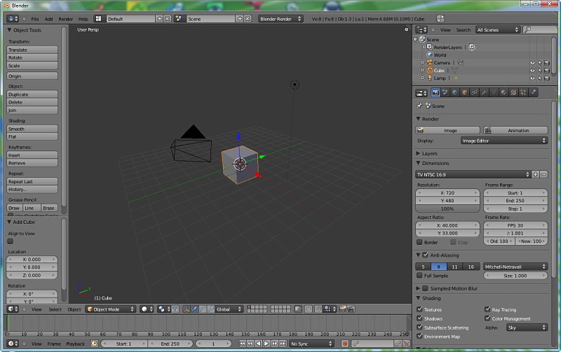
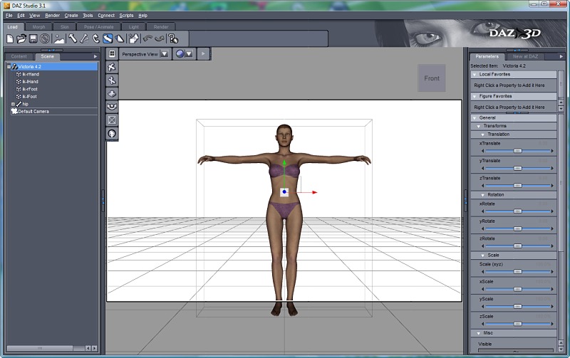
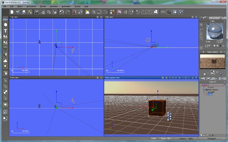
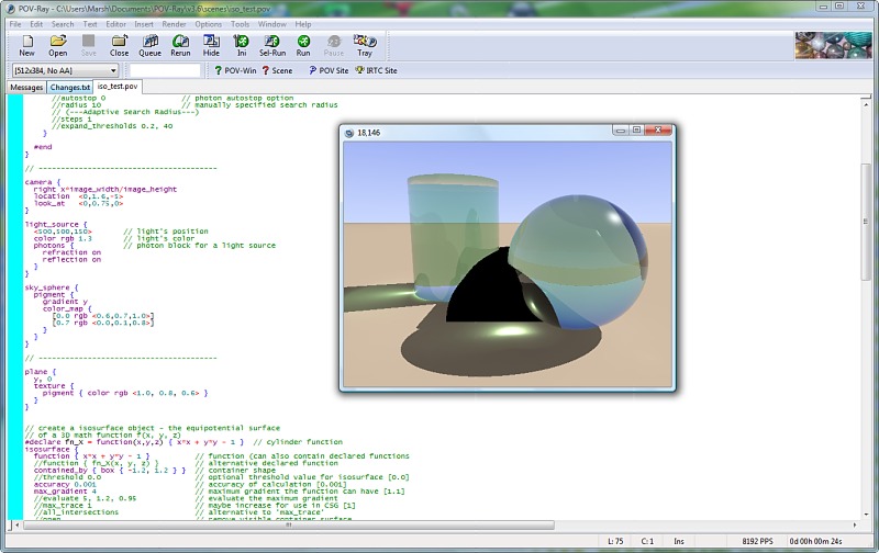
The new redesign is becoming more mainstream and looking more like other 3D applications. My particular favorite is the ‘scene’ panel in upper right corner (default) which shows the objects in the scene. This is very much the norm in other 3D apps. I have some examples below. You can see the difference between 2.49 and 2.56 first, and then some other 3D apps. Notice how PovRay is way different with raw code as its interface – the least friendliest GUI.